

With the Winter ’26 release, Salesforce introduced Dark Mode in Lightning Experience. Dark Mode has been introduced as a beta feature in Winter ’26, and at first it was available only for Starter Edition orgs.
It is now rolling out further with Spring ’26 to Professional, Enterprise, and Developer editions.
To use Dark Mode, Salesforce requires an upgrade to Salesforce Lightning Design System 2 (SLDS 2).
This is not just a visual change. It also changes how developers design and build Lightning Web Components (LWC).
What is Dark Mode in Salesforce?
Dark Mode is a UI theme where the background is dark and text is light, instead of the traditional light background.
Salesforce now supports:
Light Mode
Dark Mode
System Default (follows OS theme)
Dark Mode applies across:
Standard Salesforce UI
Lightning pages
Custom LWCs (if built correctly)
If your custom components use fixed colors like white or black, they may not look good in Dark Mode.
Benefits of Dark Mode
- Less Eye Strain
Dark Mode is easier on the eyes, especially when working for long hours.
- Better Accessibility
Users who are sensitive to bright screens find Dark Mode more comfortable.
- Battery Saving
On OLED screens, Dark Mode can reduce battery usage.
- Modern User Experience
Dark Mode gives Salesforce a modern and professional look.
How to Enable Dark Mode in Salesforce
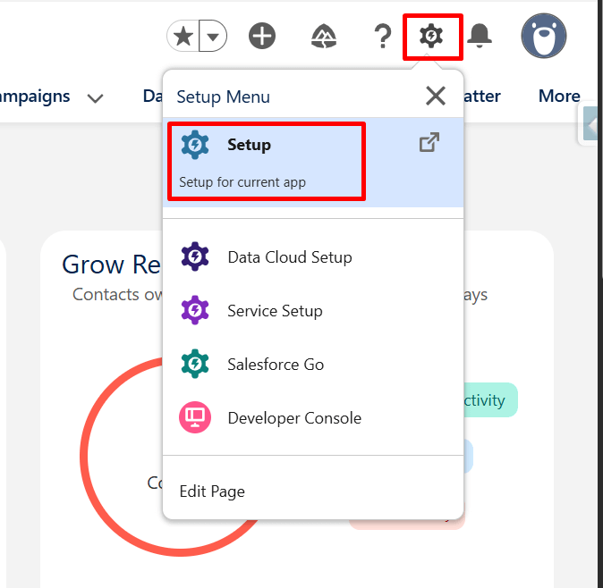
Step 1: Log in to Salesforce and Open Setup
Log in to your Salesforce org and make sure you are in Lightning Experience.
Once logged in, click the gear icon in the top-right corner of the screen and choose Setup from the dropdown menu.
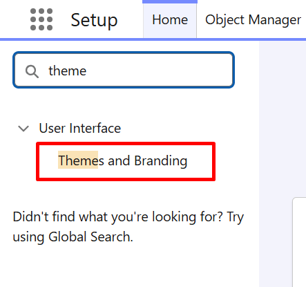
Step 2: Navigate to Themes and Branding
In Setup, use the Quick Find search box to search for Themes and Branding, then select it from the results list.
IMAGE
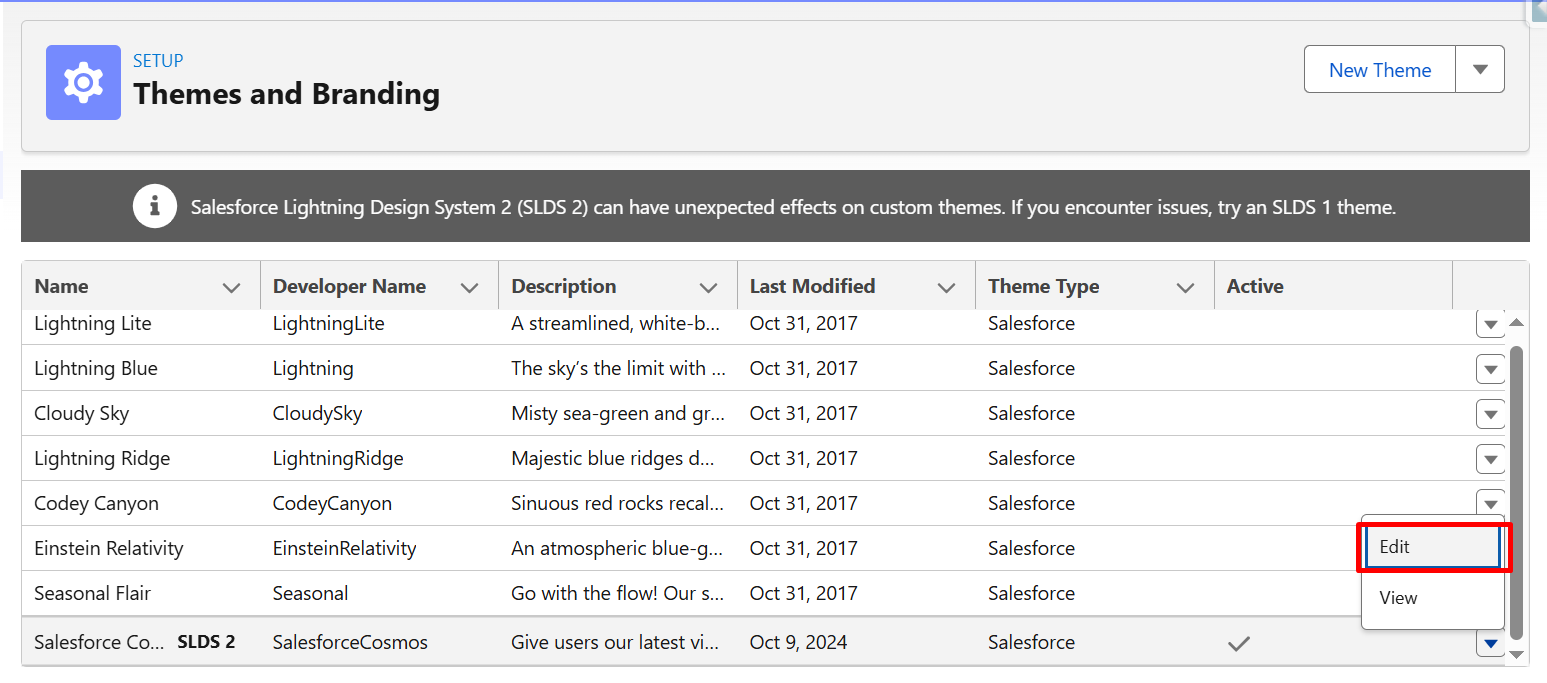
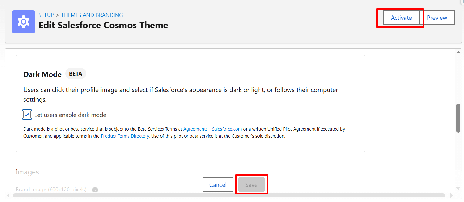
Step 3: Edit the Current Theme
From the Salesforce Cosmos theme dropdown, click Edit to modify the active theme settings in Salesforce.
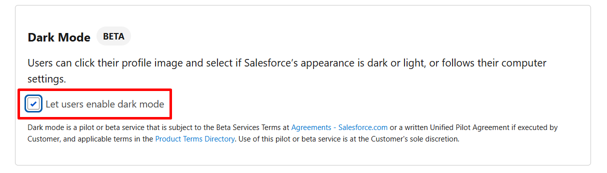
Step 4: In the Dark Mode section, select Let users enable dark mode.
Step 5: Save and Activate the Theme
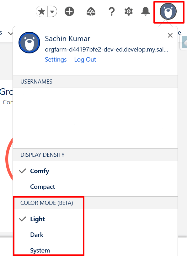
Once the theme is saved and activated, Dark Mode is enabled at the org level. Users can now choose their preferred display mode from their personal settings. To switch to Dark Mode, users need to open their profile menu and select Dark under the Color Mode (Beta) section. The interface will immediately update to the Dark theme.
If users want to return to Light Mode, they can follow the same process and select Light, or choose System to match their device’s default appearance setting.
Building Theme-Adaptive Lightning Web Components (Light & Dark Mode)
A reusable Lightning Web Component was created to display information about the currently logged-in user, including Name, Email, Username, Profile, Role, and Active status.
This component can be added to any Lightning Record Page, App Page, or Home Page using the Lightning App Builder.
More importantly, the component is designed to be theme-adaptive. It automatically adjusts its appearance when the org switches between Light Mode and Dark Mode, without requiring any JavaScript logic or a manual toggle.
The component uses Salesforce’s getRecord wire adapter to fetch the current user’s data dynamically based on the logged-in user’s Id. This ensures that the component always shows the correct user information, regardless of where it is placed.
To make the UI adapt to Dark Mode, the styling does not rely on hard-coded colors. Instead, it uses Salesforce Lightning Design System (SLDS) 2.0 design tokens, such as surface and text tokens. These tokens are automatically resolved by Salesforce based on the active theme (Light or Dark), which allows the same component to blend naturally with the rest of the Salesforce UI.
LWC CODE:
HTML
Using SLDS 2.0 Design Tokens for Theme Adaptation
To ensure that the Lightning Web Component adapts seamlessly to both Light Mode and Dark Mode, styling is implemented using Salesforce Lightning Design System (SLDS) 2.0 design tokens instead of hard-coded color values.
Tokens such as –slds-g-color-surface-container-1 and –slds-g-color-on-surface-1 are used to define the background and text colors of the component. These tokens automatically resolve to appropriate color values based on the active theme, allowing the same component to render correctly in both light and dark environments. Border and secondary text colors are handled using tokens like –slds-g-color-border-1 and –slds-g-color-on-surface-2, ensuring consistent contrast and readability.
This approach makes the component visually consistent with standard Salesforce UI elements and eliminates the need for separate stylesheets or conditional logic for different themes.
Salesforce provides a wide range of design tokens through the Lightning Design System, covering surfaces, text, borders, spacing, and typography. By leveraging these tokens, developers can build Lightning Web Components that are not only visually aligned with the Salesforce look and feel but are also future-proof and theme-ready by design.
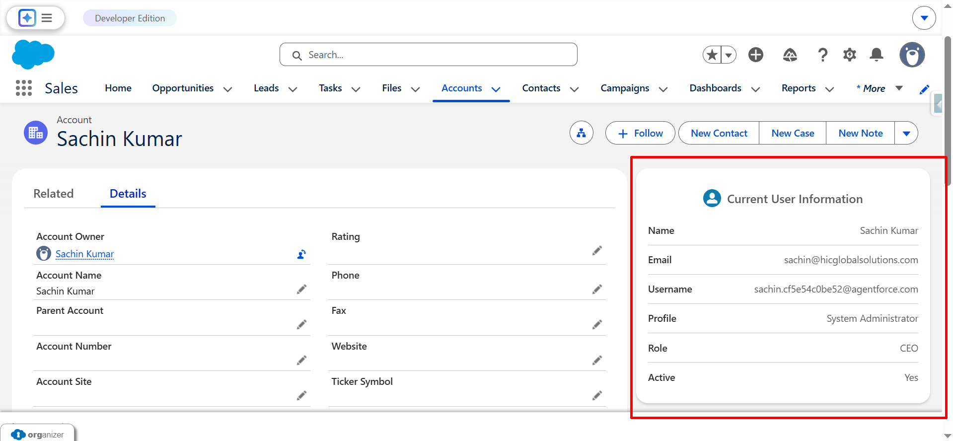
The component displayed in Light Mode, using light surface colors and dark text to match the standard Salesforce UI.
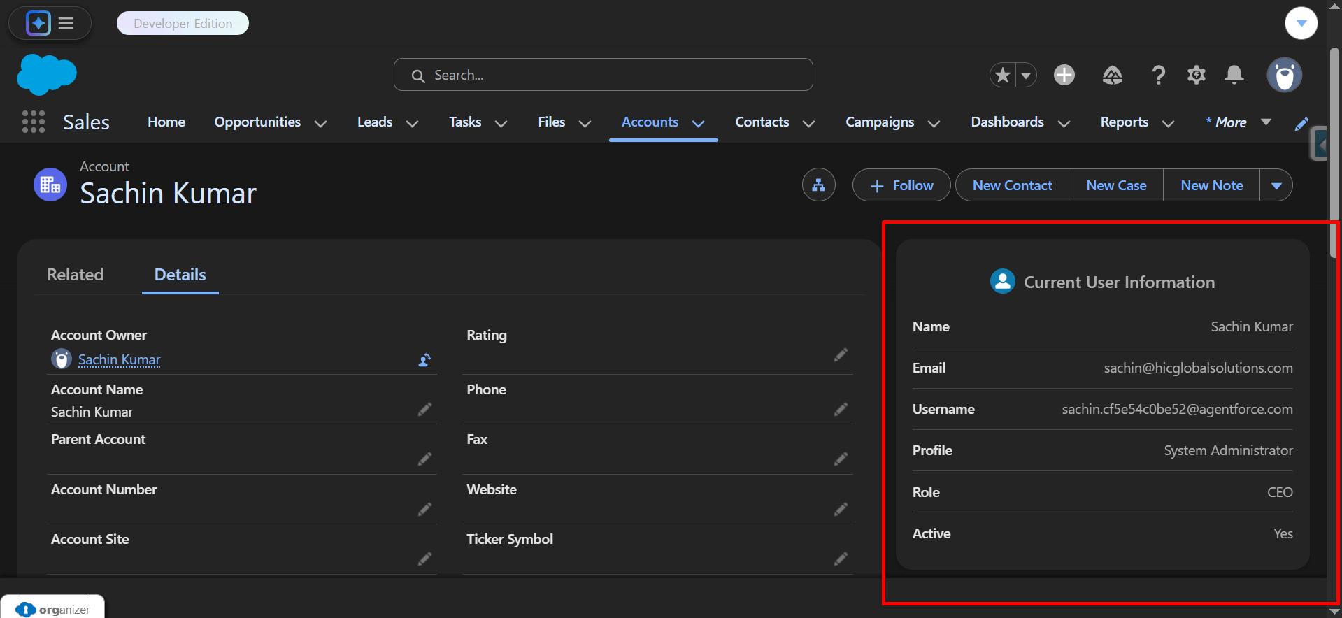
The same component displayed in Dark Mode, with background and text colors automatically adapting using SLDS 2.0 design tokens.
Watch Live Demo
https://drive.google.com/file/d/1csm-P2j5jcWN5nyuOlOD_LJ7tcPxiwWZ/view?usp=sharing
Conclusion
Dark Mode in Salesforce is not just a visual enhancement; it requires developers to build components that adapt correctly to different themes.
This implementation demonstrates how Lightning Web Components can be designed to be theme-ready by using SLDS 2.0 design tokens instead of hard-coded styles.
By relying on Salesforce-provided surface and text tokens, the same component works seamlessly in both Light Mode and Dark Mode while maintaining consistency with standard Salesforce UI elements.
This approach improves user experience, ensures accessibility, and future-proofs custom components for evolving Salesforce themes.
Building theme-adaptive components should be considered a best practice for modern Salesforce UI development, especially as Dark Mode adoption continues to grow.
No Data Found.

 India
India  USA
USA UK
UK Canada